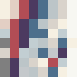
Square Project artwork
Pressure and Release
quiet vs pressure; symmetry_vs_break; diagonal_argument; counterflow; shatter against tide; hard_edges; sharp_vs_soft; island; clarity_confusion | abstract variation request 370; target batch count 500
- Grid
- 8 x 8
- Cells
- 64
- Colors
- 11
- Record
- 5dc1aa3a
Artist Statement
The emotional tone conveys a tension between quietude and pressure, symbolizing the struggle between calmness and chaos. The palette of off-white, dust gray, compressed red, dark navy, and faint peach illustrates soft versus hard contrasts, emphasizing the pressurized density with the muted fields representing quiet. The main collision occurs diagonally, where sharper, darker colors crash against the softer, lighter shades, suggesting an argument of emotions parallel to the idea of breaking against a tide, with broken pixels adding imperfection to reinforce the shattering feeling against tranquility.