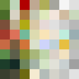
Square Project artwork
Contrasting Islands
defiance vs submission; signal_vs_noise; corner_invasion; inward_spiral; ring against stepwell; corner_sparks; dense_vs_empty; veil | abstract variation request 168; target batch count 500
- Grid
- 8 x 8
- Cells
- 64
- Colors
- 63
- Record
- 5d3d60d9
Artist Statement
This artwork explores the tension between defiance and submission through a dynamic interplay of color and form. The palette, inspired by 'resilience_fragility', emphasizes earthy and muted tones like moss green and bone white, representing submission, while rust and small gold accents represent defiance. The central block of dense, warm colors collides with the quieter, cooler edges of gray and white, illustrating the protective or opposing force around a calm core. The broken pixels create intentional disruptions, suggesting the complexity of emotions and inherent imperfections in the struggle between these forces.