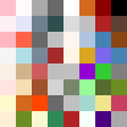
Square Project artwork
Exposure vs Shelter
vulnerability vs strength; light_vs_weight; mirror_broken; sweep; constellation against tide; closed_corners; thin_vs_heavy; horizon; safety_exposure | abstract variation request 392; target batch count 500
- Grid
- 8 x 8
- Cells
- 64
- Colors
- 54
- Record
- 5d147618
Artist Statement
The emotional tone captures the collision between vulnerability and strength, showcased through a palette that oscillates between softness and severity. The use of powder pink and warm white embodies vulnerability, while carbon black and sharp crimson signify strength. The dense center is surrounded by a spiraling layout that implies struggle, with an intentional disruption through broken pixels to enhance the feeling of an eroded edge. This art piece explores the delicate balance between exposure and shelter—where the calm pale interior meets a threatening sharp boundary.