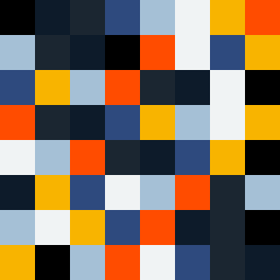
Square Project artwork
Channel of Contrast
vulnerability vs strength; exposure_vs_shelter; rising_signal; outside_inward; flood against spark; hard_edges; thin_vs_heavy; tiny_plus; connection_alienation | abstract variation request 385; target batch count 500
- Grid
- 8 x 8
- Cells
- 64
- Colors
- 8
- Record
- 5bd31620
Artist Statement
The emotional tone highlights the struggle between vulnerability and strength, represented through a dynamic arrangement of colors that flow from dense to sparse. The chosen palette of signal green, electric blue, dead black, static gray, and hot magenta reflects both confrontation and subtlety, capturing moments of tension and release. The central area is alive with saturated colors suggesting strength, while edges fade into vulnerability with softer hues, illustrating the push and pull of external forces, creating an asymmetrical flow from vivid center to muted edges. A channel of negative space emphasizes the contrast, inviting the eye to traverse the dynamic relationship.