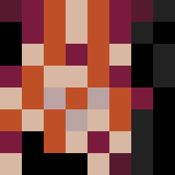
Square Project artwork
Exposure vs Shelter
vulnerability vs strength; light_vs_weight; mirror_broken; sweep; constellation against tide; closed_corners; thin_vs_heavy; horizon; safety_exposure | abstract variation request 427; target batch count 500
- Grid
- 8 x 8
- Cells
- 64
- Colors
- 7
- Record
- 5b5a84d6
Artist Statement
The emotional tone revolves around the tension between vulnerability and strength, illustrated through an interplay of pale and muted colors contrasted against strong, dark edges. The chosen palette evokes feelings of protection and exposure—strength from the deep reds and dark plums, and vulnerability from the soft cream. This collision occurs centrally, demonstrating a deep contrast that reflects the thematic focus of rising against an oppressive weight, while maintaining quiet negative space in corners for openness. The patterns embody a patchwork of strength that rises, surrounded by a frame of fragility, evoking the complex dynamics of safety and risk.