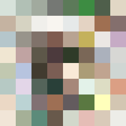
Square Project artwork
Exposure vs Shelter
vulnerability vs strength; light_vs_weight; mirror_broken; sweep; constellation against tide; closed_corners; thin_vs_heavy; horizon; safety_exposure | abstract variation request 430; target batch count 500
- Grid
- 8 x 8
- Cells
- 64
- Colors
- 64
- Record
- 59d3a0b5
Artist Statement
This artwork explores the emotional duality of vulnerability and strength through a balance of light and dark tones. The palette features soft, pale colors representing vulnerability (bone white, moss green) contrasted against stronger, earthier tones (rust, stone gray). The main collision occurs towards the center, where the pale interior, denoting openness, meets the stable, darker edges that imply strength and frame. Broken pixels signify intentional disruptions, suggesting fragility within strength, evocative of a hinge that could swing either way. The layout is largely empty with a focus off-center, creating an inviting yet cautionary space, resonating with the themes of exposure and safety.