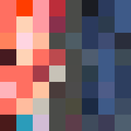
Square Project artwork
Exposure vs Shelter
vulnerability vs strength; light_vs_weight; mirror_broken; sweep; constellation against tide; closed_corners; thin_vs_heavy; horizon; safety_exposure | abstract variation request 286; target batch count 500
- Grid
- 8 x 8
- Cells
- 64
- Colors
- 42
- Record
- 59948a4d
Artist Statement
The composition explores the emotional contrast between vulnerability and strength by creating a center pulse where a pale exposed square meets dense darks at the edges. The colors chosen reflect warmth (coral and blood orange) clashing against cooler, heavier tones (charcoal and hollow blue), embodying a clash between safety and exposure. The broken pixel elements introduce imperfection, enhancing the theme of vulnerability, while the dark edges suggest strength, stability, and boundaries. The central collision area invites a feeling of transition from safety to exposure, amplifying the tension between these opposite emotions.