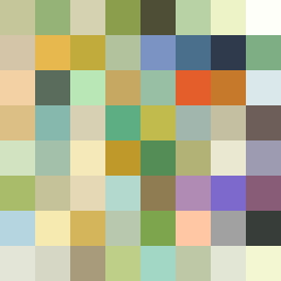
Square Project artwork
Exposure vs Shelter
vulnerability vs strength; symmetry_vs_break; cross_current; braid; flood against stack; pressure_border; fast_vs_slow; tiny_face; desire_emptiness | abstract variation request 32; target batch count 500
- Grid
- 8 x 8
- Cells
- 64
- Colors
- 64
- Record
- 5992ebd4
Artist Statement
The emotional tone explores the tension between vulnerability and strength through contrasting color dynamics. The selected palette of ripe green, acid green, honey gold, deep olive, and cream emphasizes a range of emotional states, from softness to anchored resilience. The placement of brighter fields at the center symbolically represents exposure, while muted shades and broken pixels around the edges create an intentional sense of vulnerability. The main collision occurs centrally, where echoes of strength and vulnerability intersect, inviting tension and complex patterns of emotional interplay.