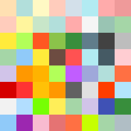
Square Project artwork
Fragile Horizons
vulnerability vs strength; light_vs_weight; mirror_broken; sweep; constellation against tide; closed_corners; thin_vs_heavy; horizon; safety_exposure | abstract variation request 314; target batch count 500
- Grid
- 8 x 8
- Cells
- 64
- Colors
- 49
- Record
- 58fe78ef
Artist Statement
This artwork explores the tension between vulnerability and strength. The colors drawn from the chosen palette of 'safety_exposure'—shelter green, warm brown, pale skin, cold white, and open blue—create a foundation that balances warmth and coolness. The central block of pale skin and open blue suggests an exposed core, while the edges of warm brown and shelter green surround it, embodying strength and offering protection. The deliberate ‘broken pixels’ introduce irregularities, enhancing the sense of vulnerability. The evolution from lighter colors to darker at the corners conveys a narrative of safety encroaching upon exposure, with the main collision occurring in the center—visually representing the struggle between the two emotional states.