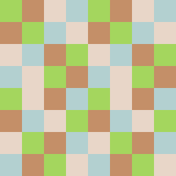
Square Project artwork
Exposure vs Shelter
safety vs exposure; pressure_vs_release; split_vertical; echo_right; braid against ripple; pressure_border; thin_vs_heavy; vessel; softness_severity | abstract variation request 71; target batch count 500
- Grid
- 8 x 8
- Cells
- 64
- Colors
- 4
- Record
- 58cffd11
Artist Statement
The emotional tone reflects a dynamic between vulnerability and protection. The selected palette embodies this through 'shelter_green' and 'warm_brown' representing safety, contrasted with 'open_blue' for exposure. The persistent echo of 'cold_white' allows for an expansive but refreshing space against the weight of the central colors. The main contrast occurs in the center, where the colors collide—creating a gradient from calm to pressure, suggesting the push-pull nature of exposure. Broken pixels further enhance the irregularity, suggesting vulnerabilities in the protective edges while maintaining the integrity of an abstract story.