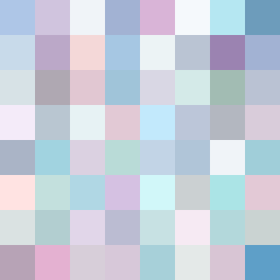
Square Project artwork
Exposure vs Shelter
vulnerability vs strength; light_vs_weight; mirror_broken; sweep; constellation against tide; closed_corners; thin_vs_heavy; horizon; safety_exposure | abstract variation request 119; target batch count 500
- Grid
- 8 x 8
- Cells
- 64
- Colors
- 62
- Record
- 562af4c1
Artist Statement
The emotional tone reflects a delicate interplay between vulnerability and strength, using a palette of pastel hues that evoke a sense of melancholy wonder. The colors—rain blue, lavender gray, soft cyan—serve as a muted contrast, while the deeper muted plum acts as an anchoring field. The main collision happens in the center, where the ‘broken_frame’ and ‘glitch’ patterns intersect, symbolizing the tension of exposure and protection. This tension is reflected in the sparse arrangement of pixels, with intentional disruptions creating the sense of an imperfect yet beautiful structure, reminiscent of life's fragility versus its resilience.