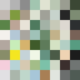
Square Project artwork
Exposure vs Shelter
vulnerability vs strength; exposure_vs_shelter; rising_signal; outside_inward; flood against spark; hard_edges; thin_vs_heavy; tiny_plus; connection_alienation | abstract variation request 453; target batch count 500
- Grid
- 8 x 8
- Cells
- 64
- Colors
- 64
- Record
- 53e9ce0f
Artist Statement
This piece conveys the emotional dichotomy between vulnerability and strength through contrasting patterns and colors. The palette features shelter green for stability, warm brown for earthiness, pale skin for exposure, cold white representing isolation, and open blue for hope. The main collision occurs in the center with a pale skin color surrounded by dense lattice patterns of brown and green, symbolizing the tension between the desire for shelter and the peril of exposure. The edges are intentionally fragmented with broken pixels to represent the frailty and interruptions inherent in these emotions.