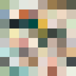
Square Project artwork
Contrast of Resilience
vulnerability vs strength; exposure_vs_shelter; rising_signal; outside_inward; flood against spark; hard_edges; thin_vs_heavy; tiny_plus; connection_alienation | abstract variation request 63; target batch count 500
- Grid
- 8 x 8
- Cells
- 64
- Colors
- 64
- Record
- 5373d801
Artist Statement
The emotional tone reflects the tension between vulnerability and strength, explored through the palette of earthy greens and muted warm tones. The frame-like borders embody strength, while the center showcases a pale white area representing exposure. This core is interrupted with sharp contrasts of rust and gray, creating a collision of protection and exposure. The seed inspired a pattern of escaping edges that anchors the composition, illustrating a dynamic interplay of solid and ephemeral, as well as the balance of density and receding spaces.