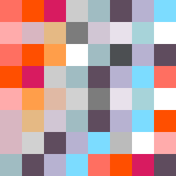
Square Project artwork
Exposure vs Shelter
vulnerability vs strength; light_vs_weight; mirror_broken; sweep; constellation against tide; closed_corners; thin_vs_heavy; horizon; safety_exposure | abstract variation request 92; target batch count 500
- Grid
- 8 x 8
- Cells
- 64
- Colors
- 21
- Record
- 4f7aee7b
Artist Statement
This piece reflects the emotional tension between vulnerability and strength, utilizing a palette of warm and muted tones to highlight conflict. The colors hot coral and blood orange embody warmth and strength, while dust pink acts as a soft, vulnerable highlight. Charcoal introduces the weight of pressure, creating a dynamic contrast with the hollow blue, suggesting a loss or an absence. The main collision occurs in the center, where dense, warm embers draw focus, amidst a quieter backdrop, embodying the idea of exposure within a protective framework. This arrangement evokes a narrative of safety intertwined with exposure, addressing the fragility and resilience of the human experience.