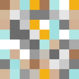
Square Project artwork
Exposure vs Shelter
safety vs exposure; pressure_vs_release; split_vertical; echo_right; braid against ripple; pressure_border; thin_vs_heavy; vessel; softness_severity | abstract variation request 330; target batch count 500
- Grid
- 8 x 8
- Cells
- 64
- Colors
- 17
- Record
- 4f1c89a0
Artist Statement
This composition explores the emotional contrast between safety and exposure, using a palette that combines warm brown and cool blue to symbolize protection and vulnerability respectively. The layout employs a quiet channel at the center, dividing dense clusters of crack and broken frame patterns, which reflect pressure against vulnerability. The tension arises from the collision of warm colors on one side and cool colors on the other, manifesting a push and pull between the conflicting emotions, echoing the seed's themes of pressure and release.