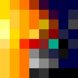
Square Project artwork
Exposure vs Shelter
vulnerability vs strength; light_vs_weight; mirror_broken; sweep; constellation against tide; closed_corners; thin_vs_heavy; horizon; safety_exposure | abstract variation request 32; target batch count 500
- Grid
- 8 x 8
- Cells
- 64
- Colors
- 29
- Record
- 4b82eeb9
Artist Statement
This piece embodies the tension between vulnerability and strength through a sharp contrast of colors. The central pale area symbolizes exposure, surrounded by a dense outer layer that represents shelter. The chosen palette of yellow, orange, muted purple, and deep blue evokes a sense of warmth contrasted by melancholic undertones. The collision occurs in the center, where the light yellow meets deep blue, creating a visual dichotomy that mirrors the themes of lightness and weight. The broken pixels are incorporated to introduce imperfections, symbolizing emotional scars and the fragility of the balance between these opposing themes.