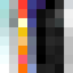
Square Project artwork
Exposure vs Shelter
restlessness vs peace; memory_vs_motion; diagonal_argument; edge_crawl; flame against shatter; closed_corners; light_vs_dark; patch; signal_noise | abstract variation request 336; target batch count 500
- Grid
- 8 x 8
- Cells
- 64
- Colors
- 62
- Record
- 4ab7800b
Artist Statement
This artwork embodies the emotional dichotomy of restlessness and peace, evoking a gentle pulse against an uneven rhythm. The chosen palette—soft aqua, misty gray, vibrant red, deep ink blue, and clear white—reflects serenity and urgency, suggesting a delicate balance. The placement of colors forms an interrupted diagonal, emphasizing contrast with patches of tranquility colliding against restless, erratic accents. The corner invasion layout creates a sensation of spreading unease while leaving space for calmness to resonate, highlighting the layered narrative of exposure against shelter. Broken pixels disrupt the flow, adding texture and imperfection, symbolizing the scars of memory against the backdrop of motion.