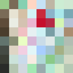
Square Project artwork
Exposure vs Shelter
safety vs exposure; pressure_vs_release; split_vertical; echo_right; braid against ripple; pressure_border; thin_vs_heavy; vessel; softness_severity | abstract variation request 453; target batch count 500
- Grid
- 8 x 8
- Cells
- 64
- Colors
- 63
- Record
- 49d37b9f
Artist Statement
The emotional tone emerges from the tension between warmth and coolness, reflecting safety and exposure. The selected palette ranges from 'shelter_green' and 'warm_brown' for warmth, to 'cold_white' and 'open_blue' for exposure. The contrast occurs along a vertical split, where a densely braided pattern (representing safety) on one side collides with a lighter crosshatched pattern (representing exposure) on the other, creating a feeling of pressure against release. This echoes the chaos of vulnerability and comfort, capturing the essence of the seed in an abstract yet intentional arrangement.