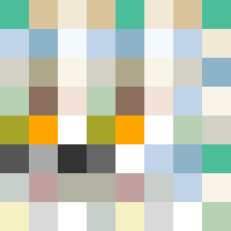
Square Project artwork
Exposure vs Shelter
safety vs exposure; pressure_vs_release; split_vertical; echo_right; braid against ripple; pressure_border; thin_vs_heavy; vessel; softness_severity | abstract variation request 50; target batch count 500
- Grid
- 8 x 8
- Cells
- 64
- Colors
- 24
- Record
- 48cc834a
Artist Statement
The emotional tone of this artwork embodies the tension between safety and exposure. The palette features saturated greens and browns suggesting stability (shelter) contrasted with pale skin tones and cold whites indicating vulnerability (exposure). The top-weighted edge style forms a protective border, while the descending pixels represent incoming pressure and the delicate balance between the two emotions. The principal collision manifests where the warmer tones interrupt the cooler ones, creating a visual echo of the emotional dichotomy. The playful braid and patchwork patterns interweave, evoking a sense of complexity in the narrative, while maintaining clarity in the abstract structure.