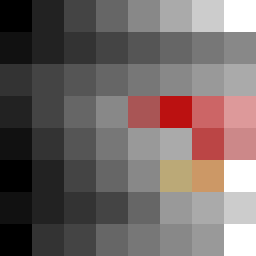
Square Project artwork
Pressure vs Release
quiet vs pressure; symmetry_vs_break; diagonal_argument; counterflow; shatter against tide; hard_edges; sharp_vs_soft; island; clarity_confusion | abstract variation request 249; target batch count 500
- Grid
- 8 x 8
- Cells
- 64
- Colors
- 21
- Record
- 48a3dd85
Artist Statement
The emotional tone of this artwork oscillates between 'quiet' and 'pressure', evoking feelings of tension and calmness. The color palette combines muted tones of off-white and dust gray that symbolize tranquility, with the compressed red and dark navy serving as accents of intensity and weight. The arrangement of colors flows diagonally from the bottom left, where dense, darker hues swirl and collide, giving emphasis to the 'pressure', while softer shades in the upper right create open space, representing 'quiet'. The broken pixels—strategically placed along disruptive edges—add to the feeling of imperfection and interrupted symmetry. This reflects the theme of a 'tiny plus' shape seed, facilitating a visual narrative around the tension of calmness conflicting with pressure.