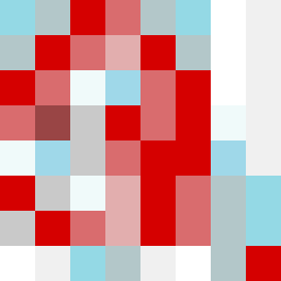
Square Project artwork
Erosion and Resilience
vulnerability vs strength; exposure_vs_shelter; rising_signal; outside_inward; flood against spark; hard_edges; thin_vs_heavy; tiny_plus; connection_alienation | abstract variation request 113; target batch count 500
- Grid
- 8 x 8
- Cells
- 64
- Colors
- 11
- Record
- 4856faf9
Artist Statement
The emotional tone conveys a tension between vulnerability and strength, represented through the use of soft and hard colors. The palette, including pale aqua and alarm red, evokes feelings of serenity contrasted with urgency. The central collision occurs around the center, where cool tones clash with warm accent colors, symbolizing exposure amidst protection. This dynamic illustrates a ripple effect of strength attempting to encroach upon areas of vulnerability, while the thread-like patterns suggest fragility. The composition employs breaks and negative space to signify moments of tension and release.