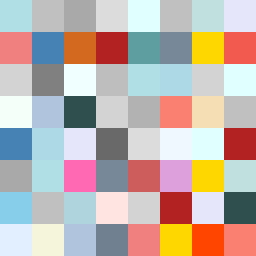
Square Project artwork
Center vs Edges
vulnerability vs strength; exposure_vs_shelter; rising_signal; outside_inward; flood against spark; hard_edges; thin_vs_heavy; tiny_plus; connection_alienation | abstract variation request 499; target batch count 500
- Grid
- 8 x 8
- Cells
- 64
- Colors
- 38
- Record
- 47cec9dd
Artist Statement
This artwork reflects the emotional contrast between vulnerability and strength through the use of a split vertical layout. The left side represents vulnerability with softer, muted colors like pale aqua and mist gray, evoking a sense of fragility and exposure. The right side contrasts this with stronger colors, alarm red and ink blue, symbolizing resilience and solidity. The central collision creates tension, visually hinting at an attack on the stability of the center through fragmented patterns associated with both emotions. Broken pixels in the form of subtle disruptions emphasize both exposure and protection, inviting the viewer to navigate the complex dynamics of connection and alienation.