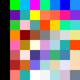
Square Project artwork
Inverted Resilience
vulnerability vs strength; exposure_vs_shelter; rising_signal; outside_inward; flood against spark; hard_edges; thin_vs_heavy; tiny_plus; connection_alienation | abstract variation request 167; target batch count 500
- Grid
- 8 x 8
- Cells
- 64
- Colors
- 54
- Record
- 45cb6bb3
Artist Statement
The emotional tone is centered around the contrast between vulnerability and strength. The palette of lime, electric blue, and magenta introduces a bright vibrancy that represents strength, juxtaposed against the black which embodies vulnerability. The corner invasion layout creates a sense of movement where the strength in brighter colors floods diagonally across the square, meeting the quiet black, which serves as a backdrop of vulnerability. The collision occurs in the center, where colors interact, embodying the duality of exposure and shelter. Its structure emphasizes asymmetry and disruption, paying homage to the complexities within vulnerability and strength, illustrated through a dynamic arrangement that invites tension and connection.