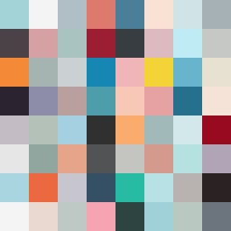
Square Project artwork
Exposure vs Shelter
vulnerability vs strength; symmetry_vs_break; cross_current; braid; flood against stack; pressure_border; fast_vs_slow; tiny_face; desire_emptiness | abstract variation request 67; target batch count 500
- Grid
- 8 x 8
- Cells
- 64
- Colors
- 63
- Record
- 45a3b643
Artist Statement
The emotional tone reflects a delicate balancing act between vulnerability and strength. The palette combines a pale aqua to signify the softness of vulnerability, contrasted with deeper shades of ink blue and alarm red representing strength and urgency. The main contrast occurs in the central cluster, where vibrant colors collide amidst softer, muted fields. This arrangement evokes a sense of tension, reflecting the desire for shelter against overwhelming emotions while maintaining an element of exposure. The pattern suggests layered channels fracturing into halos, showcasing the interdependence and conflict described in the seed.