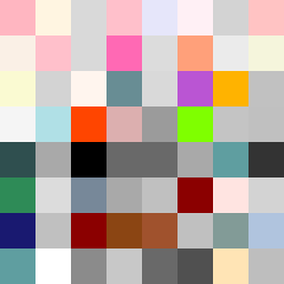
Square Project artwork
Rise vs Fall
restlessness vs peace; memory_vs_motion; diagonal_argument; edge_crawl; flame against shatter; closed_corners; light_vs_dark; patch; signal_noise | abstract variation request 58; target batch count 500
- Grid
- 8 x 8
- Cells
- 64
- Colors
- 49
- Record
- 44571b0b
Artist Statement
The emotional tone contrasts restlessness with peace, suggesting a visual and emotional oscillation. The palette chosen—soft powder pink, warm white, stark carbon black, subtle steel gray, and sharp crimson—captures the warmth of peace alongside the intensity of restlessness. The upper rows embody chaos (crosshatch pattern), while the lower rows represent tranquility (flame pattern). The main collision occurs in the center, where warm hues disrupt dark tones, echoing the push and pull of memory and motion. This asymmetry reinforces the theme of dynamic tension versus calm resolution, encapsulating the essence of the seed.