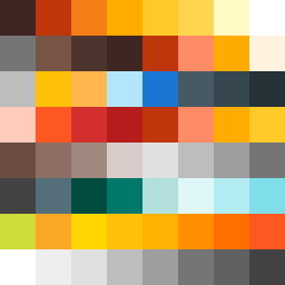
Square Project artwork
Exposure vs Shelter
vulnerability vs strength; light_vs_weight; mirror_broken; sweep; constellation against tide; closed_corners; thin_vs_heavy; horizon; safety_exposure | abstract variation request 416; target batch count 500
- Grid
- 8 x 8
- Cells
- 64
- Colors
- 47
- Record
- 4429c7e9
Artist Statement
The emotional tone navigates the balance of vulnerability and strength, depicted through the contrast of deep burnt orange and soft gold against a backdrop of charcoal gray. The burnt orange dominates, representing strength, while the pale gold hints at vulnerability. The layout follows a stacked bands approach, with thick edges representing stability layered over the inner softness, signifying exposure. The main collision occurs at the center, where the colors meet and overlap, reflecting an interplay of emotions that evoke introspection and resilience. The palette choice enhances the warmth of strength against the coolness of vulnerability, creating a dynamic tension that invites contemplation.