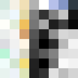
Square Project artwork
Exposed Resonance
vulnerability vs strength; exposure_vs_shelter; rising_signal; outside_inward; flood against spark; hard_edges; thin_vs_heavy; tiny_plus; connection_alienation | abstract variation request 327; target batch count 500
- Grid
- 8 x 8
- Cells
- 64
- Colors
- 62
- Record
- 3f79c7bc
Artist Statement
This piece channels the emotional contrast between vulnerability and strength, using a color palette of soft mint, faded gold, and storm gray to illustrate the delicate push and pull of human experience. The central pale area echoes vulnerability while the darker edges signify strength. The horizontal and vertical collisions create complexity, with soft colors interrupting hard shadows, representing oscillation between exposure and the need for shelter. The layout emphasizes a tense crossing at the center, while broken pixels introduce intentional imperfections that mirror life's unpredictability and fragility.