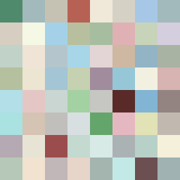
Square Project artwork
Exposure vs Shelter
safety vs exposure; pressure_vs_release; split_vertical; echo_right; braid against ripple; pressure_border; thin_vs_heavy; vessel; softness_severity | abstract variation request 498; target batch count 500
- Grid
- 8 x 8
- Cells
- 64
- Colors
- 63
- Record
- 3bf357e8
Artist Statement
The emotional tone of this artwork reflects a dynamic tension between safety and exposure, symbolized by the contrasting palette of warm browns and cool blues. The interaction of broken frame patterns, indicating shelter, collides with scars that symbolize exposure, creating a depth of emotional conflict. This is visually represented through a heavy lower section giving weight to the piece, while the upper area cascades with softer, more open colors, suggesting exposure and vulnerability. The central area serves as the main contrast, using darker tones to invoke protection while lighter shades around it create a sense of openness and air.