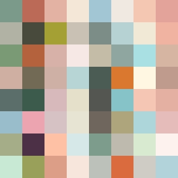
Square Project artwork
Tension in Contrast
safety vs exposure; pressure_vs_release; split_vertical; echo_right; braid against ripple; pressure_border; thin_vs_heavy; vessel; softness_severity | abstract variation request 139; target batch count 500
- Grid
- 8 x 8
- Cells
- 64
- Colors
- 64
- Record
- 39f63f91
Artist Statement
This abstract composition explores the emotional duality of safety versus exposure. The chosen colors—warm browns and greens symbolize the safety of an enclosure, while pale pinks and open blues represent the vulnerability of exposure. The grid-like pattern of the safety colors collides with the broken dot patterns of exposure, creating a visual tension that echoes the theme of protection versus openness. The dominant collision occurs slightly off-center, suggesting the struggle between the two emotional states. The use of broken pixels adds an imperfect quality, representing vulnerability and scars within the frame of safety.