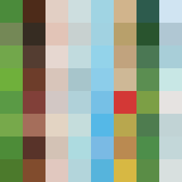
Square Project artwork
Exposure vs Shelter
safety vs exposure; pressure_vs_release; split_vertical; echo_right; braid against ripple; pressure_border; thin_vs_heavy; vessel; softness_severity | abstract variation request 377; target batch count 500
- Grid
- 8 x 8
- Cells
- 64
- Colors
- 64
- Record
- 39d57f34
Artist Statement
The emotional tone contrasts the warmth of safety with the vulnerability of exposure. The palette combines soft greens and browns to evoke shelter, balanced against pale, cool whites and blues that signify exposure. The collision occurs along the vertical split, where dense clusters of 'noise' patterns in the warm tones meet the quiet fields of 'exposure' colors, interrupted by broken pixels that symbolize the leaks of emotion. The layout creates a nearly closed frame, allowing for controlled exposure, illustrating a conflict between shelter and vulnerability.