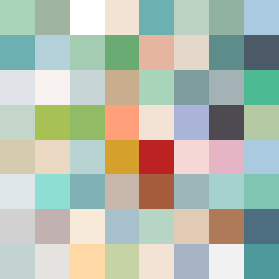
Square Project artwork
Exposure vs Shelter
safety vs exposure; pressure_vs_release; split_vertical; echo_right; braid against ripple; pressure_border; thin_vs_heavy; vessel; softness_severity | abstract variation request 492; target batch count 500
- Grid
- 8 x 8
- Cells
- 64
- Colors
- 59
- Record
- 367b076c
Artist Statement
The emotional tone reflects a tension between vulnerability and protection. The palette balances cool tones (open blue, cold white) hinting at exposure with warm tones (warm brown, shelter green) suggesting safety. The main contrast occurs through a division in the center, symbolizing the fragility of balance between the two aspects. The patterns of 'channels' and 'halo' create visual interplay, while broken pixels add to the narrative, amplifying the sense of imperfection and conflict.