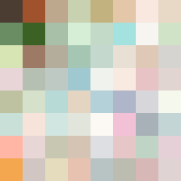
Square Project artwork
Exposure vs Shelter
safety vs exposure; pressure_vs_release; split_vertical; echo_right; braid against ripple; pressure_border; thin_vs_heavy; vessel; softness_severity | abstract variation request 395; target batch count 500
- Grid
- 8 x 8
- Cells
- 64
- Colors
- 64
- Record
- 35f0ab1f
Artist Statement
The emotional tone of this piece juxtaposes the warmth of safety against the coolness of exposure. The selected palette transitions from warm browns and greens that convey shelter to pale, open colors representing vulnerability. The left side of the grid embodies safety through a crosshatch pattern, thickened by rich colors and layered density, while the right side employs a stair-step configuration using paler tones to suggest lightness and exposure. A deliberate central collision of textures and colors symbolizes the tension between protection and openness, with broken pixels introducing intentional disruptions that add depth.