Square Project artwork
Exposure vs. Shelter
safety vs exposure; pressure_vs_release; split_vertical; echo_right; braid against ripple; pressure_border; thin_vs_heavy; vessel; softness_severity | abstract variation request 460; target batch count 500
- Grid
- 8 x 8
- Cells
- 64
- Colors
- 48
- Record
- 353c3d75
Artist Statement
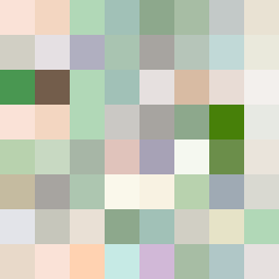
This piece captures the emotional tone of vulnerability and protection through a color palette that balances warm browns and soft greens with cool whites and a pale pink. The 8x8 grid uses a diagonal argument layout, with the warm tones (safety) occupying the bottom-left and the cool tones (exposure) thrusting into the upper-right. The broken edges signify the fragility of safety, while the thread patterns evoke a sense of ongoing tension between these two emotional states. The contrast peaks where the colors collide, particularly in the transition area, suggesting a constant push and pull between exposure and shelter.