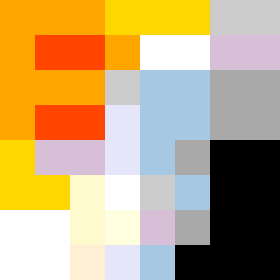
Square Project artwork
Exposure vs Shelter
vulnerability vs strength; light_vs_weight; mirror_broken; sweep; constellation against tide; closed_corners; thin_vs_heavy; horizon; safety_exposure | abstract variation request 482; target batch count 500
- Grid
- 8 x 8
- Cells
- 64
- Colors
- 13
- Record
- 34128280
Artist Statement
The emotional tone explores the duality of strength and vulnerability. A warm, vibrant palette of yellow and orange represents strength, while muted blues and purples suggest vulnerability. The collision occurs in the center where dense patterns of strength (negative crosses) confront the softer, rippling patterns of vulnerability, creating tension. The layout features a narrow negative-space path cutting through the dense colors, emphasizing the idea of a 'quiet channel' amidst chaos.