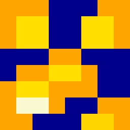
Square Project artwork
Between Protection and Exposure
vulnerability vs strength; exposure_vs_shelter; rising_signal; outside_inward; flood against spark; hard_edges; thin_vs_heavy; tiny_plus; connection_alienation | abstract variation request 148; target batch count 500
- Grid
- 8 x 8
- Cells
- 64
- Colors
- 5
- Record
- 3403e15f
Artist Statement
This composition balances the emotional tension between vulnerability and strength. The palette draws from warm tones (yellow, orange) to evoke feelings of strength and protection, contrasted with cool tones (deep blue, muted purple) that symbolize vulnerability and exposure. The main collision occurs through the broken dots and solid blocks, where soft, thin shapes punctuate the stable center, representing the fragile intersection of these contrasting emotions. The arrangement intentionally leaves negative space, allowing the viewer to sense the tension between shelter and exposure.