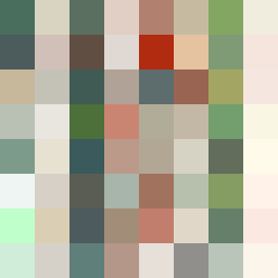
Square Project artwork
Fractured Resilience
vulnerability vs strength; light_vs_weight; mirror_broken; sweep; constellation against tide; closed_corners; thin_vs_heavy; horizon; safety_exposure | abstract variation request 495; target batch count 500
- Grid
- 8 x 8
- Cells
- 64
- Colors
- 64
- Record
- 334017f4
Artist Statement
The artwork embodies the emotional contrast between strength and vulnerability, visualizing how one can exist alongside the other. The palette, composed of moss green, bone white, rust, stone gray, and small gold, reflects a narrative of resilience amidst fragility. The center is a dense mix of earthy greens and warm rusts, symbolizing strength and stability, while the edges are lighter with bone white and stone gray, suggesting vulnerability. The collision of heavy and thin patterns — as seen in the central area versus the borders — creates dynamic movement, representing the push and pull between exposure and shelter. This creates a striking asymmetry that draws the viewer's eye towards the center, where the most intense colors meet, generating a sense of tension and release.