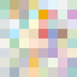
Square Project artwork
Exposure vs Shelter
safety vs exposure; pressure_vs_release; split_vertical; echo_right; braid against ripple; pressure_border; thin_vs_heavy; vessel; softness_severity | abstract variation request 152; target batch count 500
- Grid
- 8 x 8
- Cells
- 64
- Colors
- 64
- Record
- 32ef449d
Artist Statement
The emotional tone reflects a juxtaposition of the delicate balance between safety and exposure. The palette combines muted shelter green and warm brown to convey safety, contrasted against a bright pale skin and open blue that suggest exposure. The collision occurs at the center, where the two patterns overlap, creating a dynamic tension. The edge style is left-weighted, reinforcing a feeling of pressure at the borders while maintaining soft, flowing patterns that symbolize release. The abstract composition invites contemplation on vulnerability and protection.