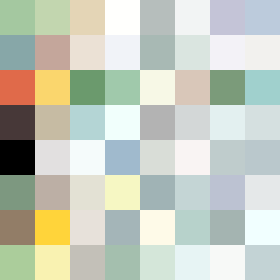
Square Project artwork
Exposure vs Shelter
safety vs exposure; pressure_vs_release; split_vertical; echo_right; braid against ripple; pressure_border; thin_vs_heavy; vessel; softness_severity | abstract variation request 273; target batch count 500
- Grid
- 8 x 8
- Cells
- 64
- Colors
- 64
- Record
- 32530295
Artist Statement
The composition explores the tension between safety and exposure, contrasting warm earthy tones representing shelter against cool pale hues suggesting exposure. The central collision comes from the vertical and horizontal patterns that intersect, creating emotional pressure. The chosen palette of greens, browns, and pale colors emphasizes both softness and severity, embodying vulnerability amidst stability. Broken pixels create intentional disruptions in the 'shelter' regions to suggest the fragility of safety.