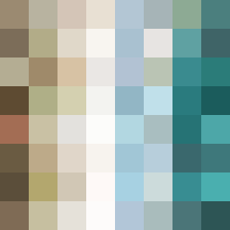
Square Project artwork
Exposure vs. Shelter
safety vs exposure; pressure_vs_release; split_vertical; echo_right; braid against ripple; pressure_border; thin_vs_heavy; vessel; softness_severity | abstract variation request 267; target batch count 500
- Grid
- 8 x 8
- Cells
- 64
- Colors
- 64
- Record
- 30ccae9a
Artist Statement
This artwork embodies the emotional tension between safety and exposure. The palette features warm brown and shelter green to evoke warmth and protection, contrasted with cold white and open blue representing exposure. The arrangement emphasizes a gentle pressure at the edges, creating a secure frame around a pale center that hints at vulnerability. The structured stripes flow vertically, symbolizing safety, while the tide-like patterns weave through, suggesting the ebb and flow of exposure. The interaction creates an echo of tension and release, with broken pixels adding imperfection that reflects the struggles between these emotions.