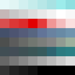
Square Project artwork
Exposure vs Shelter
vulnerability vs strength; light_vs_weight; mirror_broken; sweep; constellation against tide; closed_corners; thin_vs_heavy; horizon; safety_exposure | abstract variation request 474; target batch count 500
- Grid
- 8 x 8
- Cells
- 64
- Colors
- 60
- Record
- 30bf58f5
Artist Statement
This composition explores the delicate balance between vulnerability and strength, represented by a pale aqua core surrounded by darker hues. The contrast heightens emotional tension, with soft lattice patterns inside gently breaking against denser embers at the edges. The palette of pale aqua, mist gray, alarm red, ink blue, and clear white illustrates a clash of urgency and calm. The collision occurs at the center and the edges, creating a sense of safety exposed to the elements.