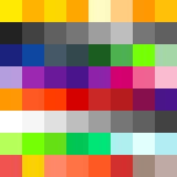
Square Project artwork
Contrast of Emotion
joy vs grief; order_vs_chaos; rising_signal; zigzag; checker against spark; burned_edges; centered_vs_off_center; bridge; machine_emotion | abstract variation request 163; target batch count 200
- Grid
- 8 x 8
- Cells
- 64
- Colors
- 53
- Record
- 2f7a1426
Artist Statement
The artwork captures the tension between joy and grief through a strategic use of colors and patterns. The palette consists of vibrant yellows and oranges to represent joy, contrasted against muted blues and purples for grief. The outer edges feature chaotic broken dots to symbolize grief, while the inner core uses a flame pattern representing joy, creating a visual vibrancy amidst the heaviness. This layout creates a sharp contrast, with an evident collision at the boundary where joy meets grief, highlighting the intricacies of emotional experiences. Negative space is utilized in the design to evoke feelings of void and openness, allowing the viewer to feel the shift from joy to grief and vice versa.