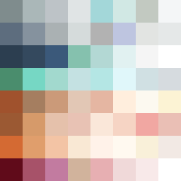
Square Project artwork
Exposure Against Shelter
safety vs exposure; pressure_vs_release; split_vertical; echo_right; braid against ripple; pressure_border; thin_vs_heavy; vessel; softness_severity | abstract variation request 72; target batch count 500
- Grid
- 8 x 8
- Cells
- 64
- Colors
- 63
- Record
- 2dc2e7e1
Artist Statement
The emotional tone reflects a tension between vulnerability and protection. The palette combines warm browns and greens to evoke safety, contrasting them with lighter blues and whites to symbolize exposure. The top rows utilize warmer, muted tones representing shelter, while the bottom half features cooler and brighter colors that suggest vulnerability and openness. The primary collision occurs in the middle of the grid, where these contrasting emotional patterns blend and interrupt each other, creating a dynamic visual narrative.