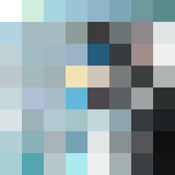
Square Project artwork
Pressure vs Release
relief vs dread; order_vs_chaos; pressure_corner; spiral_counterclockwise; crosshatch against frame; no_outline; full_vs_hollow; broken_line; ancient_fire | abstract variation request 19; target batch count 200
- Grid
- 8 x 8
- Cells
- 64
- Colors
- 63
- Record
- 2c9a99b9
Artist Statement
This artwork embodies the emotional interplay of relief and dread. The color palette of pale mint, soft sky, storm gray, near black, and faded gold evokes a transition from tension to space. The calmness of the lighter shades represents relief, while the darker, dense hues symbolize dread. The design utilizes a barcode pattern to reflect dread, clashing with a stepwell pattern suggesting relief. The main contrast occurs in the lower left corner, where darker colors cluster, creating pressure that disperses towards the upper right, suggesting a loosening of tension. The use of broken pixels evokes scars of past pressures, adding to the emotional complexity without taking on literal forms.