Square Project artwork
Exposure and Shelter
vulnerability vs strength; light_vs_weight; mirror_broken; sweep; constellation against tide; closed_corners; thin_vs_heavy; horizon; safety_exposure | abstract variation request 111; target batch count 500
- Grid
- 8 x 8
- Cells
- 64
- Colors
- 64
- Record
- 2c14bdbf
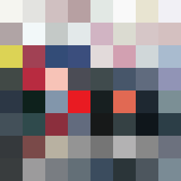
Artist Statement
The artwork embodies a contrasting emotional tone of vulnerability versus strength. The palette employs soft, muted colors such as off-white and faint peach to reflect vulnerability, while dark navy and compressed red ground the piece with strength. The central diagonal layout starkly contrasts these two emotional states, with the lower left demonstrating a fragile glitch pattern and the upper right showcasing stable negative cross patterns, suggesting a divide between exposure and protective frames. Broken pixels lead the eye towards the center, imbuing a sense of imperfection amidst the calm, enhancing the emotional depth.