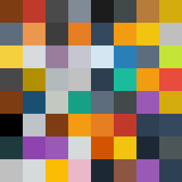
Square Project artwork
Tension of Contrasts
panic vs control; inside_vs_outside; empty_room; orbit; spark against broken_dots; top_weighted; stable_vs_unstable; arrow; love_betrayal | abstract variation request 47; target batch count 200
- Grid
- 8 x 8
- Cells
- 64
- Colors
- 47
- Record
- 2be1b006
Artist Statement
This piece encapsulates the emotional duality of panic and control through contrasting tones and spatial dynamics. The palette—dark red, burnt orange, charcoal, and gold—reflects intense emotions associated with chaos (panic) and grounding stability (control). The arrangement starts with a fiery burst of burnt orange in the top left, symbolizing the explosive nature of panic, while dark areas gradually seep in from the edges, representing control fighting to stabilize an overwhelming emotion. The use of broken pixels introduces a sense of imperfection and irregularity, amplifying the emotional turmoil while still maintaining structured elements, thus bridging the two contrasting feelings.