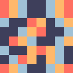
Square Project artwork
Tidal Contrast
vulnerability vs strength; light_vs_weight; mirror_broken; sweep; constellation against tide; closed_corners; thin_vs_heavy; horizon; safety_exposure | abstract variation request 268; target batch count 500
- Grid
- 8 x 8
- Cells
- 64
- Colors
- 4
- Record
- 274dc270
Artist Statement
This artwork explores the emotional tension between vulnerability and strength using a color palette that expresses warmth and coldness. The use of warm coral and soft amber suggests vulnerability, while cold slate and blue-black represent strength. The central collision occurs through the jagged clash of warm and cool as it spreads from the corner, illustrating an invasion of warmth into a cold space, symbolizing the encroachment of vulnerability into rigid strength. Broken pixels add imperfect disruptions that evoke the fragility meant by 'mirror broken.' This arrangement creates a rhythm where the softness of the frame contrasts with the stronger, braided lines, emphasizing the dynamic duality of the emotions.