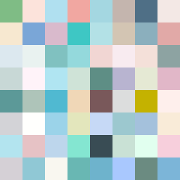
Square Project artwork
Exposure vs Shelter
vulnerability vs strength; light_vs_weight; mirror_broken; sweep; constellation against tide; closed_corners; thin_vs_heavy; horizon; safety_exposure | abstract variation request 395; target batch count 500
- Grid
- 8 x 8
- Cells
- 64
- Colors
- 64
- Record
- 264e9f70
Artist Statement
The emotional tone reflects a delicate balance between vulnerability and strength, expressed through an interplay of soft and dense colors. The selected palette, featuring shelter green and pale skin, evokes warmth and safety, while cold white and open blue communicate exposure and fragility. The main collision occurs at the center, representing a vulnerable core surrounded by protective yet heavy tones at the edges, creating both tension and sanctuary. The zigzag flow and scattered repair layout symbolize the journey of resilience and the ongoing struggle between safety and vulnerability. Each broken pixel intentionally disrupts the strong color patterns, serving as scars yet essential marks of experience.