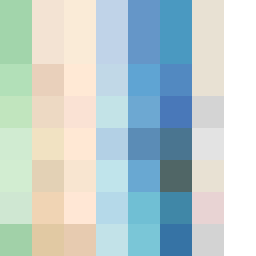
Square Project artwork
Exposure vs Shelter
safety vs exposure; pressure_vs_release; split_vertical; echo_right; braid against ripple; pressure_border; thin_vs_heavy; vessel; softness_severity | abstract variation request 175; target batch count 500
- Grid
- 8 x 8
- Cells
- 64
- Colors
- 48
- Record
- 264513f2
Artist Statement
The emotional tone balances between vulnerability and protection. The palette employs a soft green and warm brown to represent safety, while pale skin tones and open blue invoke exposure. The main contrast arises in the center, where densely packed colors collide, illustrating the tension between pressure and release, symbolizing the struggle of safety enveloping a fragile core. The layout leads from the corner, enhancing the feeling of invasion and encroachment, while subtly incorporating broken pixels for imperfection, suggesting the complexity of sheltering an exposed center.