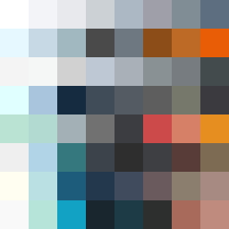
Square Project artwork
Exposure vs Shelter
vulnerability vs strength; light_vs_weight; mirror_broken; sweep; constellation against tide; closed_corners; thin_vs_heavy; horizon; safety_exposure | abstract variation request 297; target batch count 500
- Grid
- 8 x 8
- Cells
- 64
- Colors
- 64
- Record
- 25f58d6a
Artist Statement
The emotional tone centers around the duality of strength and vulnerability. The palette of clean white, ice blue, ink black, violet gray, and warning orange embodies both clarity and confusion. The use of white and pale blue represents light vulnerability, while the darker colors signify strength and stability, with white occupying the center to evoke exposure. The main collision occurs in the central area, where the tension between these emotions is strongest, portrayed by overlapping patterns of fault lines and noise, creating a sense of protected chaos. The rising signal layout evokes hope against a backdrop that hints at weight, with broken pixels introducing imperfection into the otherwise orderly composition.