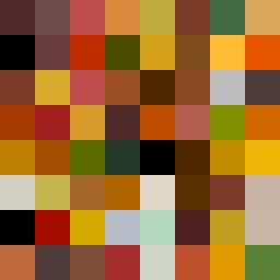
Square Project artwork
Exposure vs Shelter
vulnerability vs strength; symmetry_vs_break; cross_current; braid; flood against stack; pressure_border; fast_vs_slow; tiny_face; desire_emptiness | abstract variation request 272; target batch count 500
- Grid
- 8 x 8
- Cells
- 64
- Colors
- 57
- Record
- 2530b8f6
Artist Statement
The emotional tone reflects a balance of vulnerability and strength. The chosen palette of burnt orange, dark red, charcoal, and gold symbolizes a grounding strength contrasted against an exposed, delicate vulnerability. The main collision occurs in the center, where checker patterns of lighter colors disrupt the denser, robust hues, suggesting a push-pull dynamic of protection versus exposure. This aligns with the seed's call for interaction between emotional extremes and creates a visual narrative of complex emotional landscapes.